Design Ideas
|
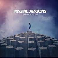
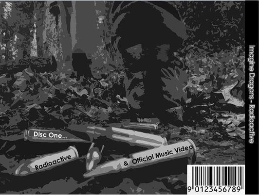
This is the official Imagine Dragons digipak . We have used this as inspiration for our two designs copping the main aspects of the cover such as the boy standing back to the camera looking out into the distance. We believed this would fit in well with our post- apocalyptic theme if we could incorporate the different aspects of it into our digipak.
|
|
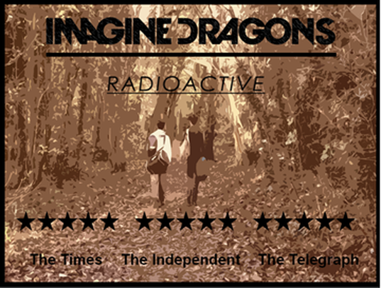
Our first design (paper copy) shows two survivors looking out on a field with their backs facing the camera, there are burning buildings in the background to resemble the post apocalyptic theme. This is similar to Imagine Dragons album cover of Radioactive which shows a young male with his back facing the camera looking out into the distance. We have used the same typography as the original cover as we have attempted to make our album cover similar, but add our own twist to it with the burning buildings in the background. This shows our interpretation of the song with a post-apocalyptic theme apparent in our design. Through using images found on the internet and editing our own images we created a rough copy of our second design. It is similar to our first idea as two people who look to be survivors have their back to the camera looking into the background at burning buildings. We believe that this is our preferred idea as it fits in with our goals of meeting Imagine Dragons ideologies. It is also visually more similar to the official album cover of Imagine Dragons.
|
|
|
Our second idea for our digipak and advert cover was to use certain shots from our music video environment, this will relate to our music video more and keep the same look through-out our project. For the front cover our idea was to use the same platform used in our video for our performance and have our survivors look out into the distance to create suspense as the audience don't know what they are doing or where they are. We will use cold and darker colours such as blacks and greys to relate to the indie-rock theme that Imagine Dragons are representing. This theme will be used also for the inside of our digipak and the back cover as-well to stay consistent with our work. Concerning our advert our idea is to have image of the two survivors back facing the camera walking into the distance. This, like our front cover, is to create mystery and tension as it shows that the two people are on a journey. It is also important for our advert to include eye catching typography to make our advert stand to our audience. All of the previous Imagine Dragons CD front cover have this, and for us to represent them correctly we will implement this in our design.
|
|
Advert Rough Draft |
|
CD Front Cover Rough Draft |
|
Inside Cover Rough Draft |
|
Back Cover Rough Draft |
|
Audience feedback
After our first design we asked some of our target audience about what they would like to see in our final design of our CD cover and Advert, in order to gain their opinion on whether our CD cover and Advert would suit the bands ideologies.
The first candidate's response was that he didn't like the burning buildings in the background as they were not present in the final music video, however he thought it was good that we used the concept from the Imagine Dragons album cover with the main character facing away from camera. Also, that we should reconsider what the two main characters were standing on as it appears they are standing on a building which he thought was not as good as the Imagine Dragons one with the man on the stones. We took this audience feedback as we showed the lead singer's back to the camera with the disc and also showed the two band members on top of an abandoned building performing.
The second candidate's response was that he was pleased again with the characters facing away from camera however said that we should consider an alternative colour scheme from the black background with the yellow fire. Our group strongly agreed with this as we felt the post-apocalyptic theme was not present with the colour scheme currently employed, therefore we changed the colour scheme in the final album cover and advert to a black and white with a blur and a brown tint with a blur.
The third candidate's response was that he wanted to see a different colour scheme all together as he thought that the album cover did not represent our indie rock genre effectively. This was important advice for our group as we changed the colour scheme to black and white which was present in the indie rock genre with album covers such as "The XX You Got The Love" using black and white effectively.
